Financial Flow
2025
Increased completion and adoption by clarifying the application process and improving trust

Problem area
Useful product, confusing process
Users were reaching the final steps of a financial product application only to abandon the process, even after a hard credit pull. Through research, data and design expertise I discovered a deeper trust and comprehension issue within the experience.
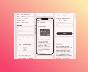
Product before redesign and After redesign - Data capture
Original application wireframe - Revamped application.
Images for illustrative purposes only.
Key Issues Identified
Users did not clearly understand what would happen next in the application
The application focused heavily on form completion, not on setting expectations
Limited reassurance or transparency at moments of high uncertainty
Design Strategy
Reframing the experience from a transactional form into a guided application journey.
Build trust before asking for commitment
Reduce cognitive load at high-stress moments
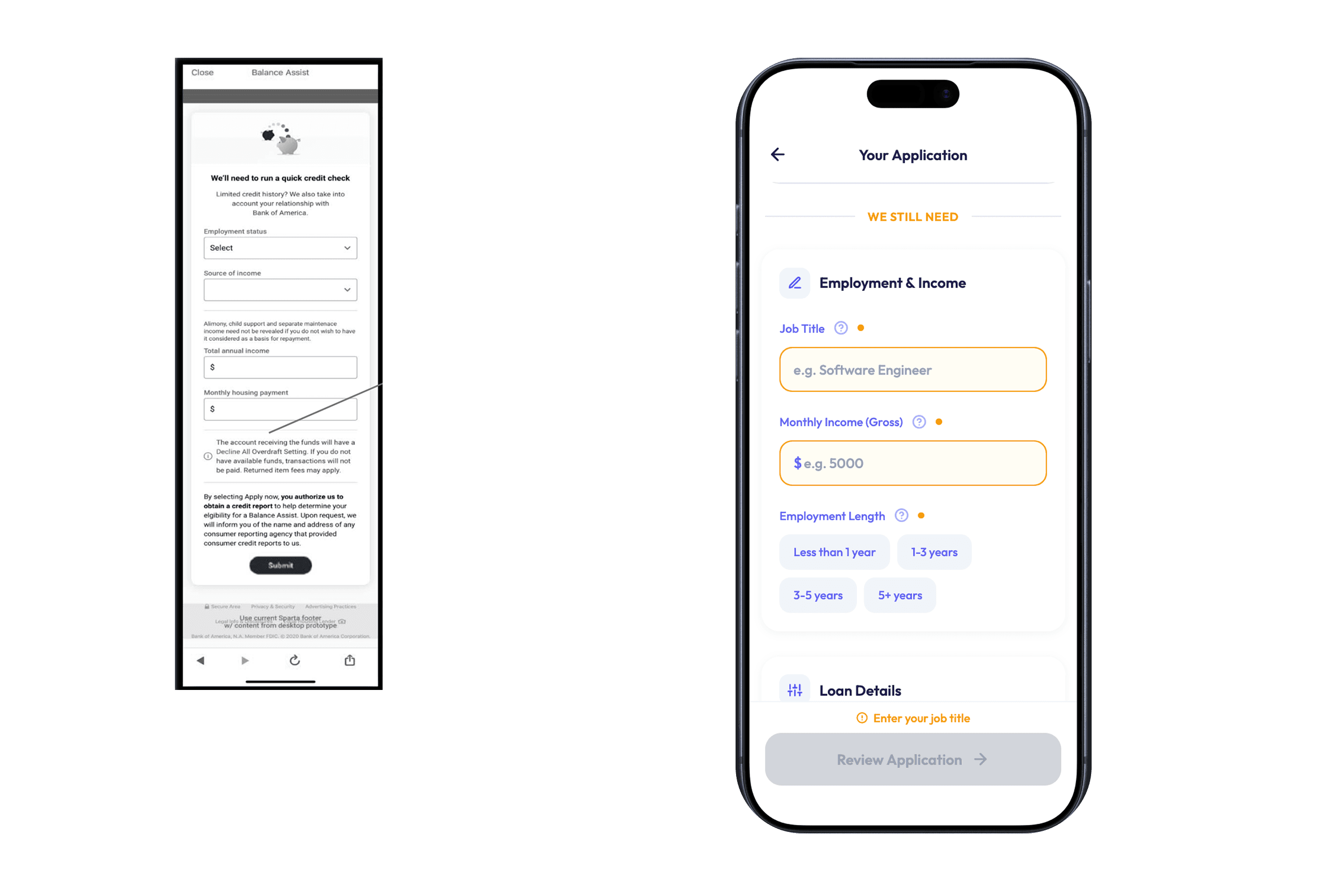
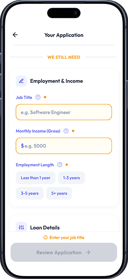
Design decision 01
Application Transparency
We set expectations from the get go: Here's how the application works, here's why the process is so streamlined, here's why we have some information and why we still need X.

We set expectations from the get go: Here's how the application works, here's why the process is so streamlined, here's why we have some information and why we still need X.
Design decision 02
Enhance Trust-Building Moments
We introduced patterns that helped guide the user without overwhelming them, with specific elements.

1. Stepper
Reassure the user where they are and how many steps are left
2. Labels
It reduces users confusion about the WHY behind the logic of the application.
3. Adaptive FAQs
Following information we already had of our costumer and the questions we were tracking via research and costumer support.
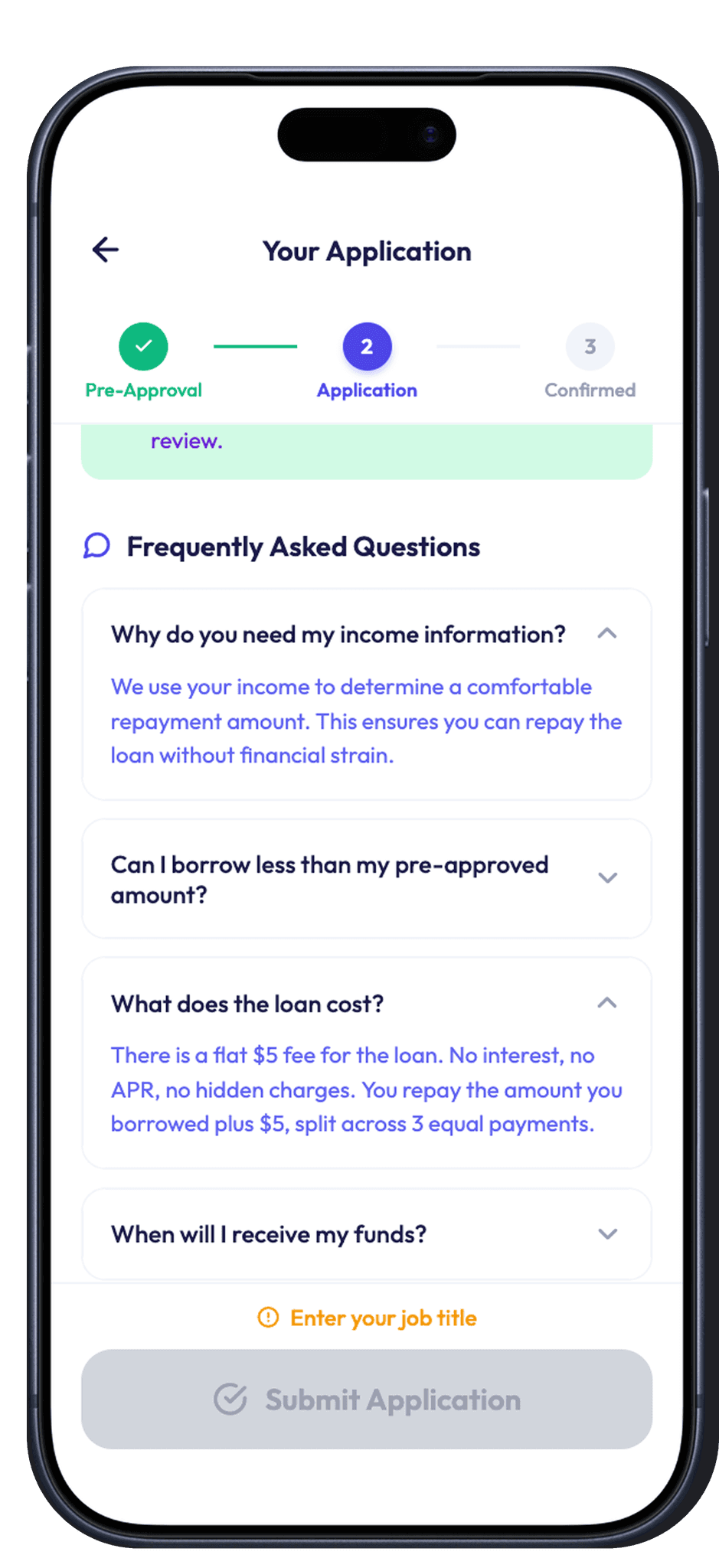
Design decision 03
Improved Review & Confirmation
We're all used to complex and long bank application forms. Since this journey was so streamlined, it actually was counterintuitive for our costumer. A key moment was to enhance the final step, making the difference of states between the step where the credit pull would happen and the post, pre-approved spot. I explored two directions: a traditional layout and a minimalist one. I went for simplicity because this specific product needs a very small amount of extra data and benefits from a quick scanning, in accordance
Final version: What I learned testing with our users: the application's simplicity is an asset when paired with support for the user and transparency.


Learning 01
Unclear priorities: It wasn't clear how or why getting approved was so expedite. Reinforcing the why was key.
Learning 02
Too much noise: The amount of information wasn't answering the questions the costumers actually had.
Retrospective